Scratch Off Posters Design Tips
Before you start putting digital paint to digital canvas, make sure you begin your artwork file with the right settings in place.
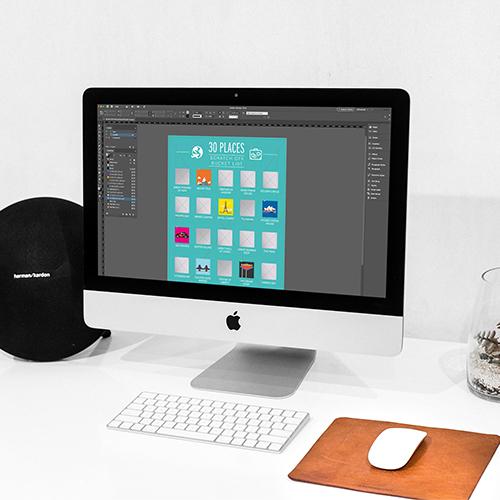
You can use any design software you like to create your scratch cards design, as long as it can save your finished artwork as a PDF. The ScratchOffPosters.co.uk team can also accept other file types; see our FAQs for more details.
We recommend using Adobe Illustrator or InDesign, although Photoshop may also be useful if you’re planning a design which uses photography.
Set your artwork dimensions to match the size of the scratch cards or posters you’re looking to print, plus a bleed area of at least 3mm and a 300ppi resolution.
It’s a good idea to set up a safe zone, 5mm in from the edge of the poster size and 10mm for A4 size and upwards. This can help you avoid placing key text and graphics too close to the paper edge, where they may get trimmed off accidentally.
Make sure your design software is set to CMYK colour mode, rather than RGB mode.
Keep it simple
As with any graphic design project, less is more. The most attractive poster designs are the ones that keep things simple.
Use colours sparingly and smartly. Avoid using more than two, maybe three fonts max.
Choose a neat and tidy layout with a decent amount of space between each element.
Get your list ready before you start
With a bucket list scratch-off poster, diving straight into the artwork design is always
tempting, but if you haven’t nailed down the actual list of items you’ll be displaying, you’ll likely end up having to rearrange and redo parts of your design from scratch.
Decide how many items will feature on your list, and don’t start designing until your list is complete. If you run out of item ideas, no problem; bringing the number down won’t mess up your artwork plans if you haven’t started the artwork!
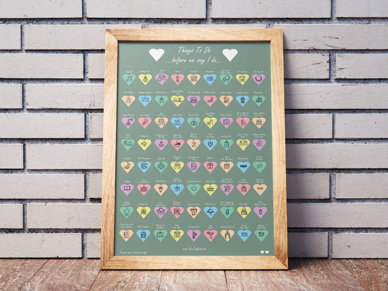
Then, before you start crafting jaw-dropping art, draw out a basic layout sketch first with spaces for every item on your list. Here, you’ll be able to identify if your current number of items is a problem; perhaps you’ll need to add some more or take some away to make each row of items match.
Make your poster more ’readable’ with icons
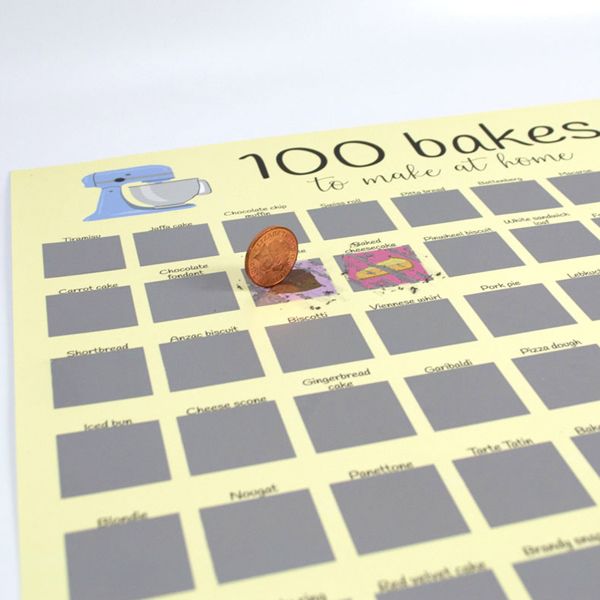
The best scratch-off list posters are the ones where each individual item on the list is visible at a glance, even if you’re standing a couple of feet away.
Of course, this can be tricky to achieve without producing a cramped, overwhelming design.
We’d recommend printing your posters on the biggest paper size you can find – here at ScratchOffPosters.co.uk, our standard sizes go up to A1, but we can also print larger custom sizes depending on your requirements.
Icons can be a handy solution here, since even if you’re not close enough to the poster to read it, you can still identify each item on the list.
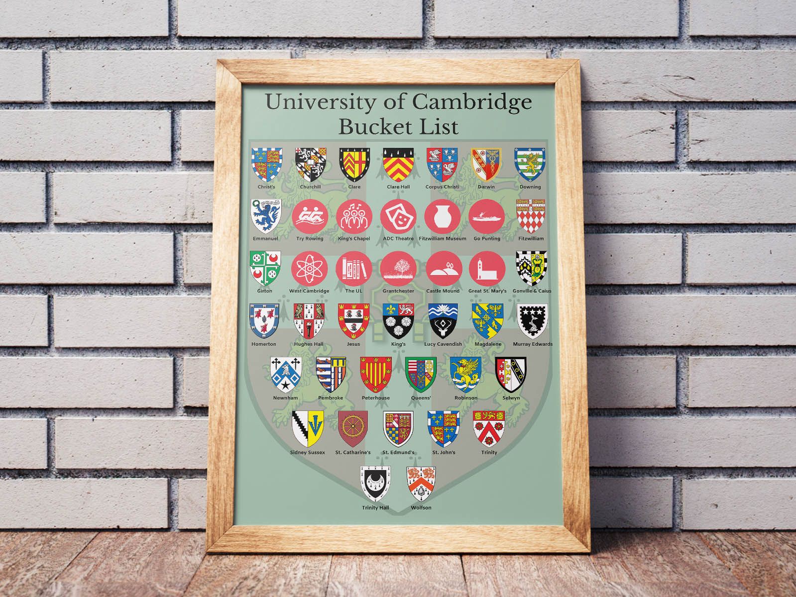
Proofread, proofread, proofread
When you’re putting together a ‘top 100’ list, it’s surprisingly easy to feature the same list item twice by accident.
Be sure to go over your list with a fine-tooth comb for any duplicates. Again, it’s better to do this at the early stages of your design, as it’ll mean less work if you have to fix it.
